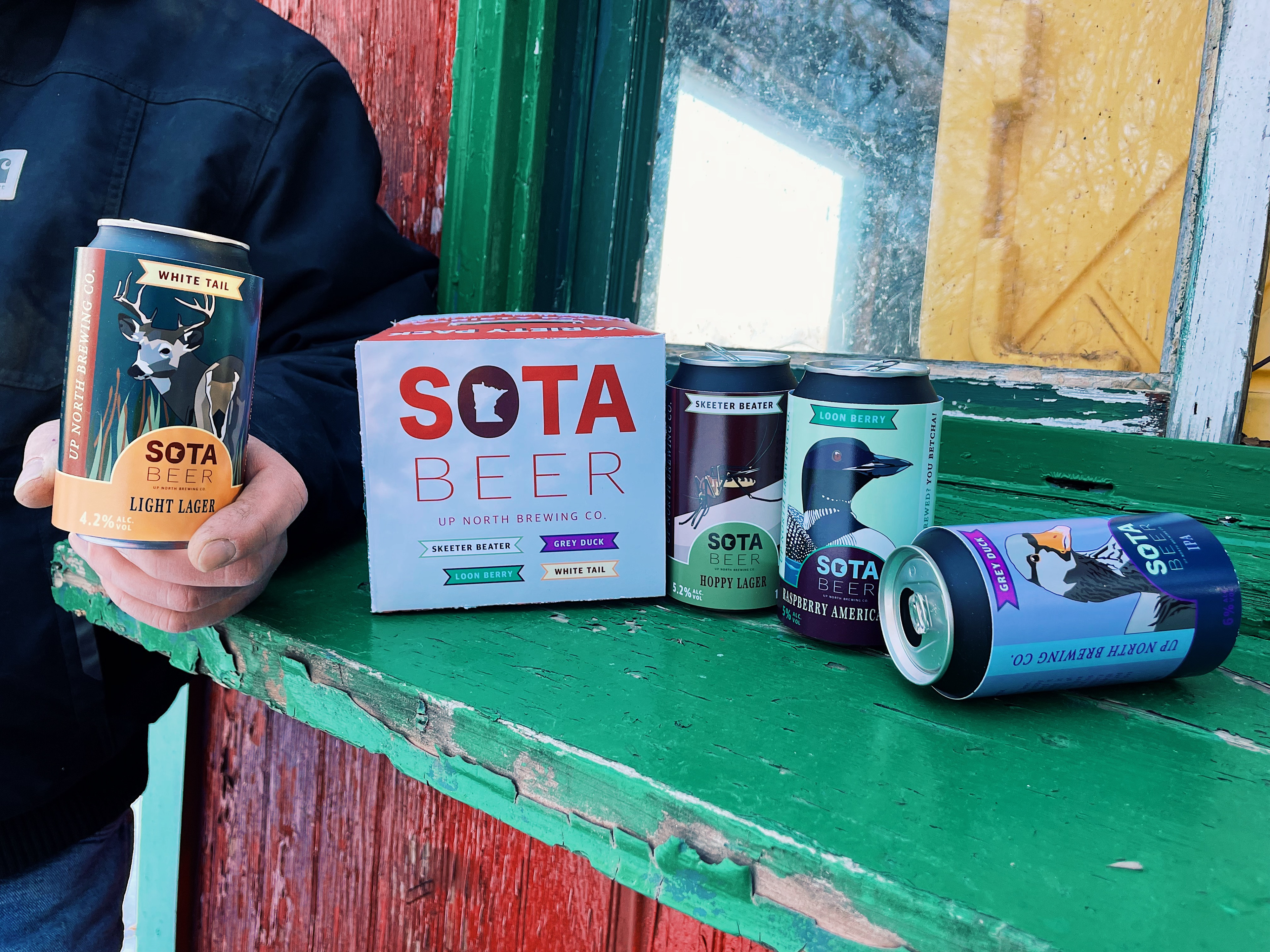
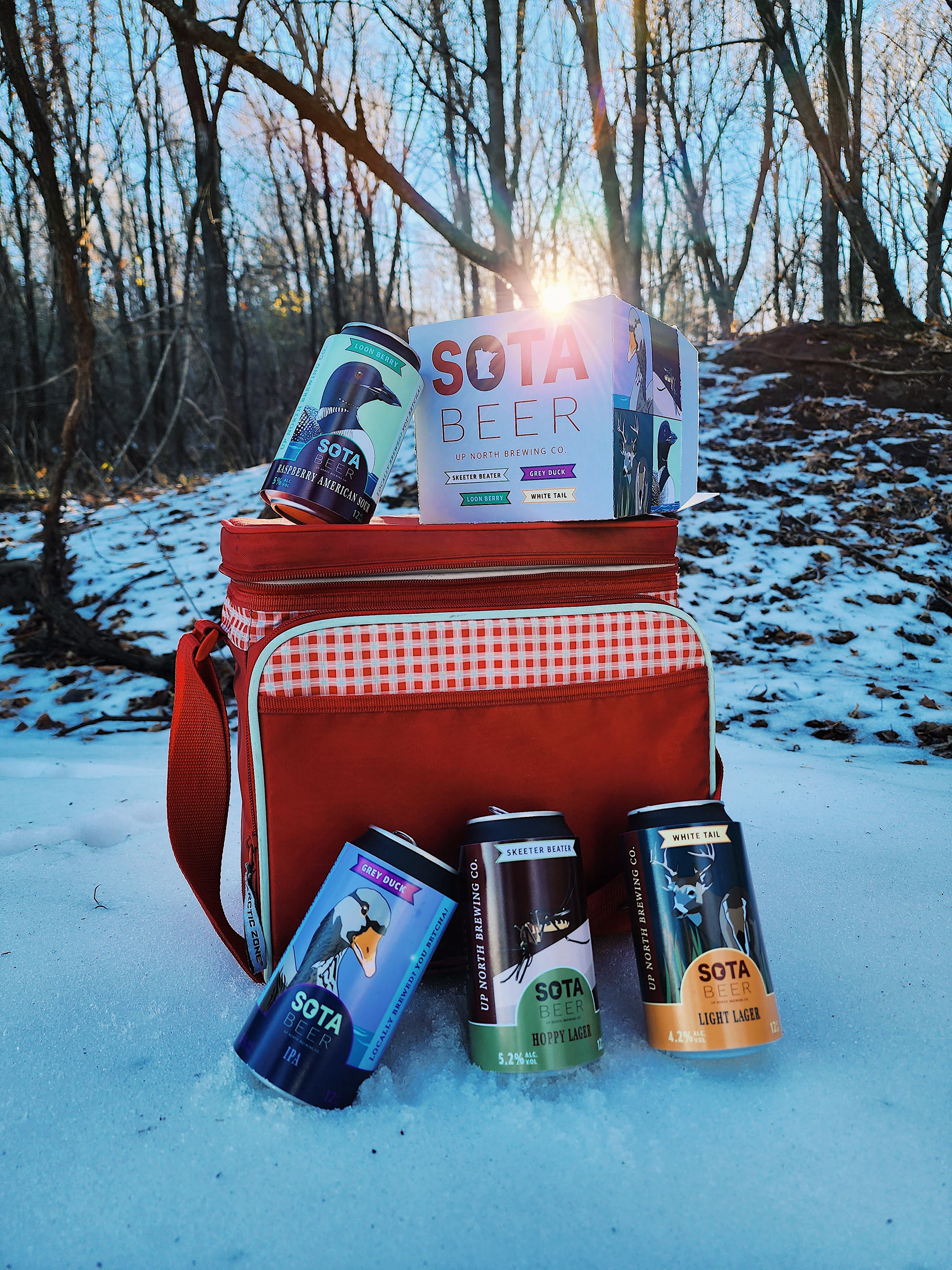
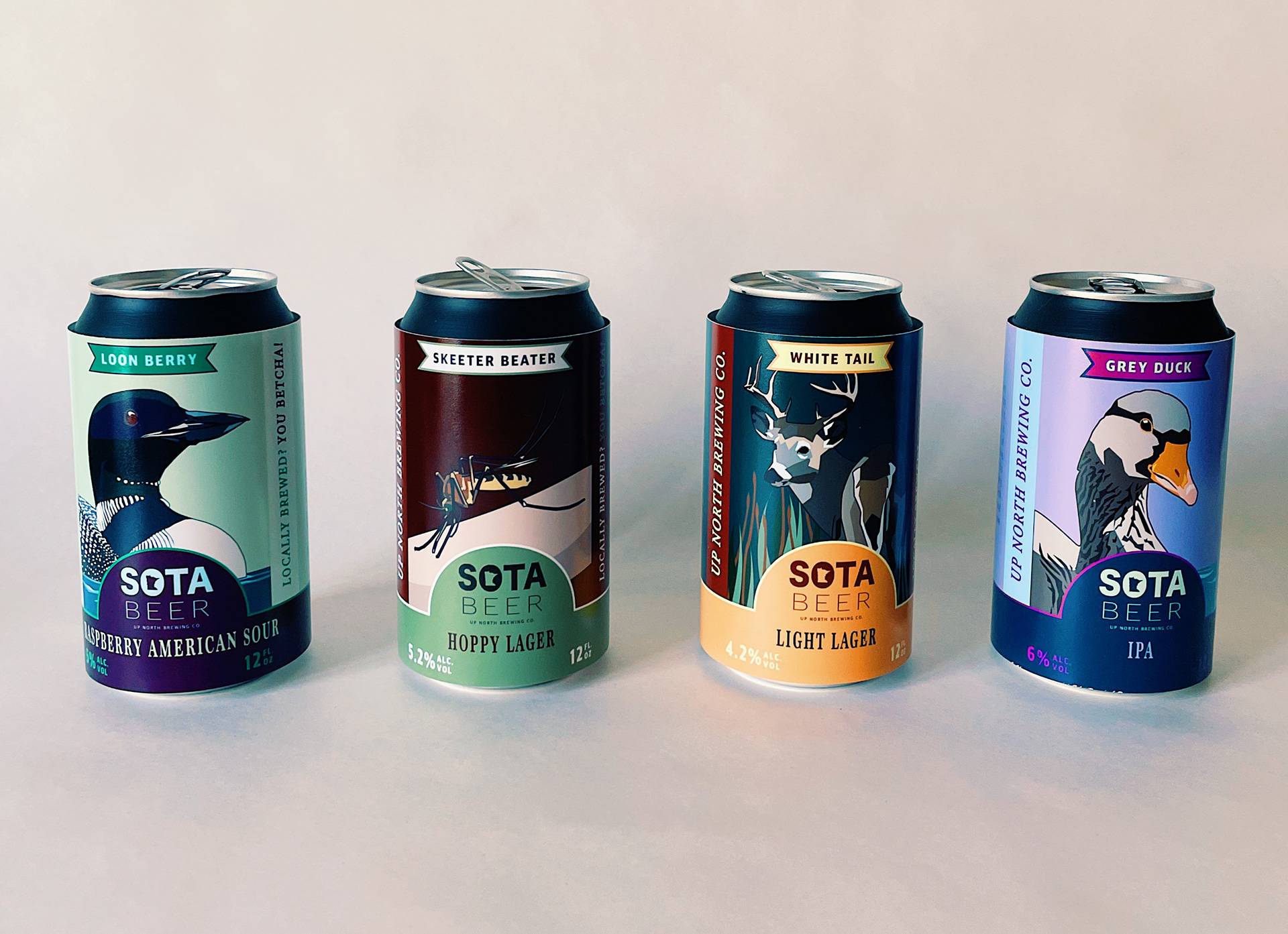
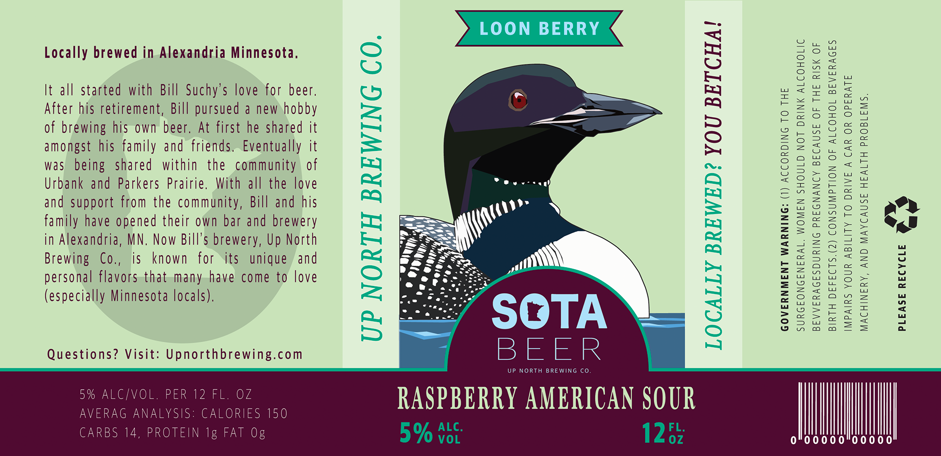
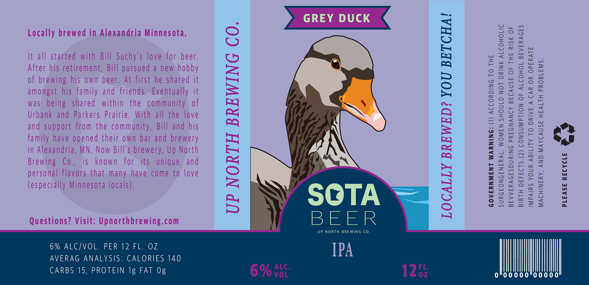
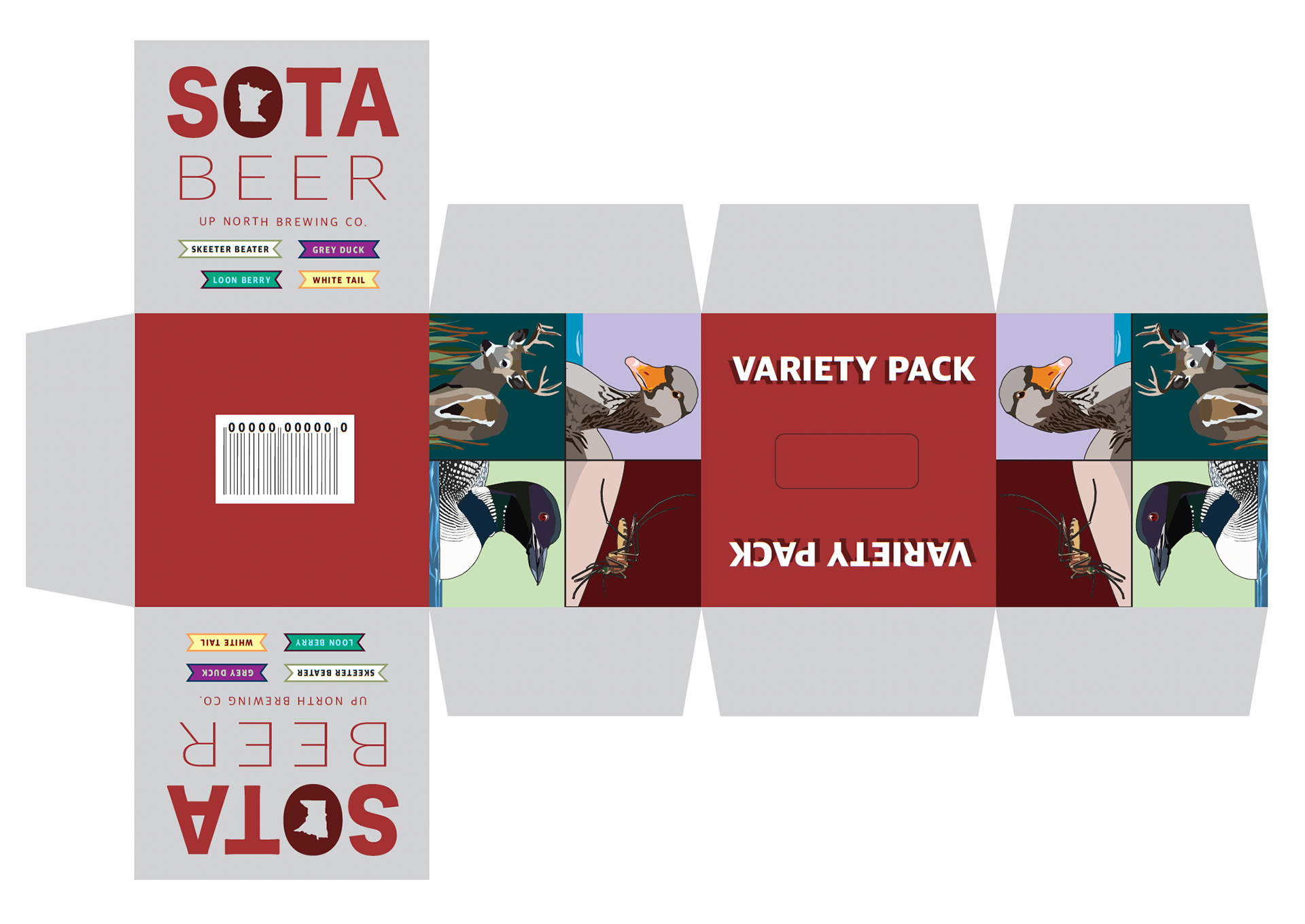
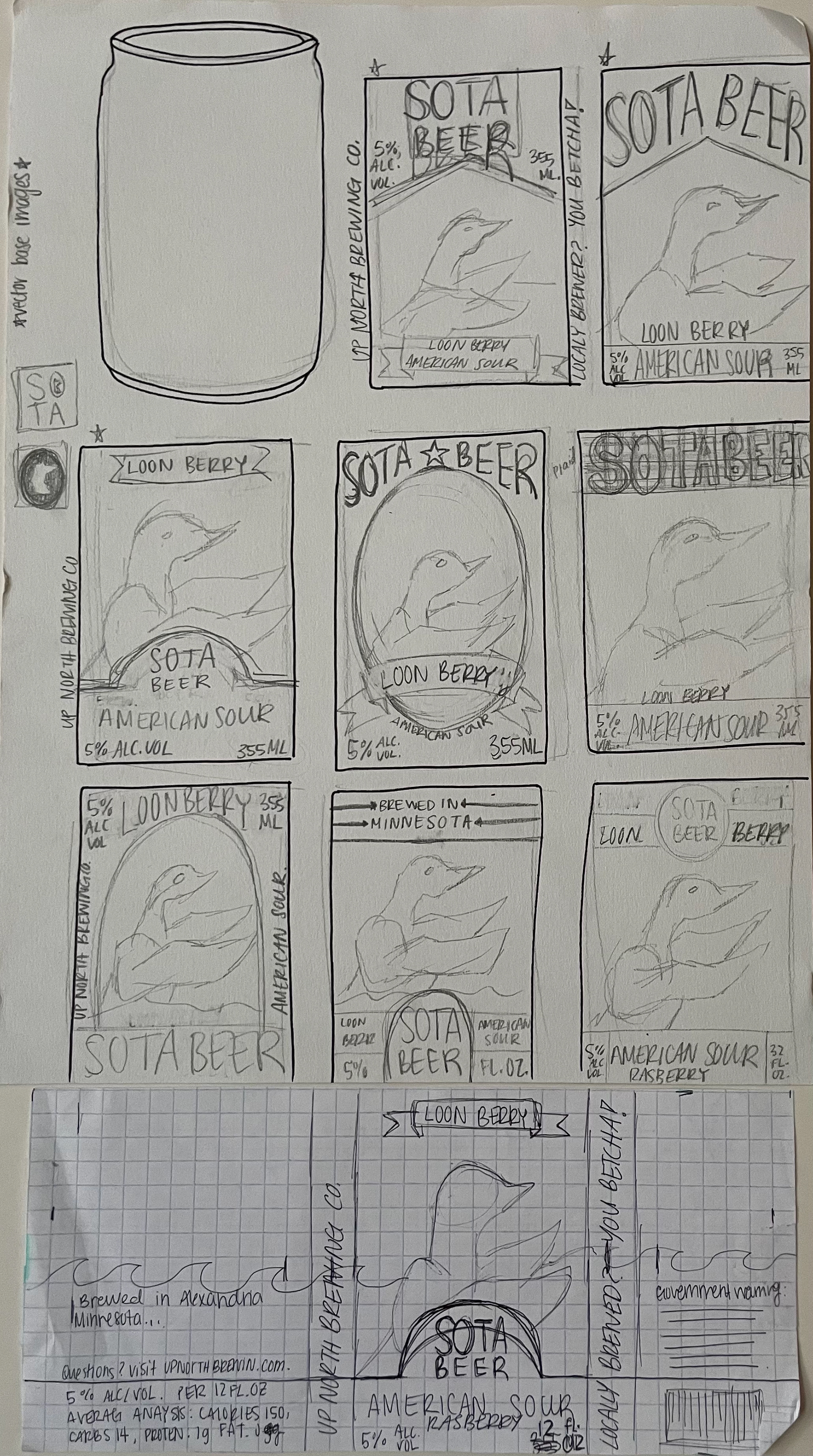

Project Overview: SOTA Beer is a comprehensive packaging and branding project designed to capture the unique cultural identity of the Minnesota local craft beer market. The objective was to create a cohesive parent brand that highlights local imagery, traditions, and culture. By leaning into distinct local lore, the branding establishes an immediate, nostalgic connection with Minnesota consumers. Design Strategy & Execution: I curated four distinct flavor profiles from the ground up, ensuring that each individual beer featured a dedicated color palette, custom illustration, and a tailored narrative that matched the specific beer style: Loon Berry: A nod to Minnesota’s official state bird, featuring a vibrant, berry-infused palette. Gray Duck: A playful, highly localized reference to the classic childhood game unique to the state ("Duck, Duck, Grey Duck"). The packaging utilizes a bright and fun color palette with an illustration of a Grey Duck in the center. White Tail: Designed with the state’s rich hunting heritage in mind, this label uses an earthy color palette and illustration of the white-tailed deer to appeal to outdoor enthusiasts. Skeeter Beater: A humorous, lighthearted take on Minnesota's notorious summer mosquito season. The design uses the darkest color palette to add further depth to the set of beers. The Result: The final product line balances unified typography with highly individualized packaging. By combining custom character illustrations with thoughtful color theory, SOTA Beer stands out on the shelf as a premium and deeply relatable. It is a distinctly locally crafted beverage and a Minnesotan experience.